Like development, when purely looking at the end result, brilliant design may look easy, but it’s the process of distilling information into something clear that reveals the true master. Through our incredible designers, we have produced beautiful, intuitive and memorable tech products for businesses of all shapes and sizes. We have a pool of great designers, vetted and directed by us, so you get agency quality design at competitive prices, with the Deazy ‘pinch’ of flexibility to scale up and down. Winner.
Our core design principles
Strategy
In order to plan well, we always start with understanding the tech product vision and ambitions, identifying who the target users are and what the core user journeys will be
Clarity
From branding and messaging right through to the overarching information architecture or each screen layout, clarity is consistently the key to a winning tech product
Impact
As visual creatures we make intuitive decisions quickly, so impact through compelling User Interface (UI) and branding is the difference between a good and exceptional result
Our services
Your business in pixels and ink
Branding is a critical part of every business, because not only is it what makes a memorable impression on consumers but it allows your customers and clients to know what to expect from your company. It is a way of distinguishing yourself from the competitors and clarifying what it is you offer that makes you the better choice.
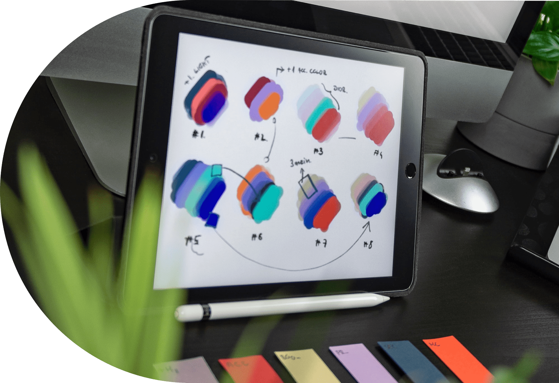
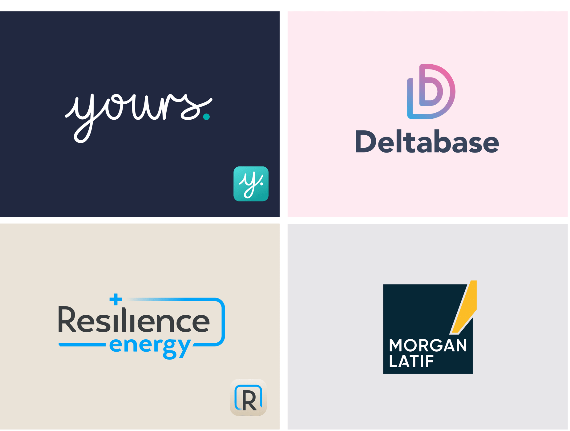
We have worked with our clients across a number of industries and sectors to craft unique brands that have standout and audience appeal
Brand Identity
Through effective branding, you will make a memorable impression on your consumers. They’ll know just what to expect from your company and in an environment of digital bombarding, you will confidently reach and engage with them, so that you can concentrate on delivering your products and services with success. We have supported our clients from a range of industries to do just that. From energy companies, to luxury furniture makers, we have helped to establish and reposition brands, and ensure that their brand goes beyond a logo, across all marketing streams with cohesion.
Brand Guidelines
In order to root your brand style and see that consistency is maintained across every medium and facet of your business, brand guidelines can play an important role. Brand recognition can also be increased across the industry and amoungst customers, when a brand’s image has cohesion. Covering colours, choice of fonts and logo use as a minimum, these guidelines can continue to be built upon as the brand is established, to cover topics like tone of voice, illustration and icon styles as well as photography style, to name just a few.
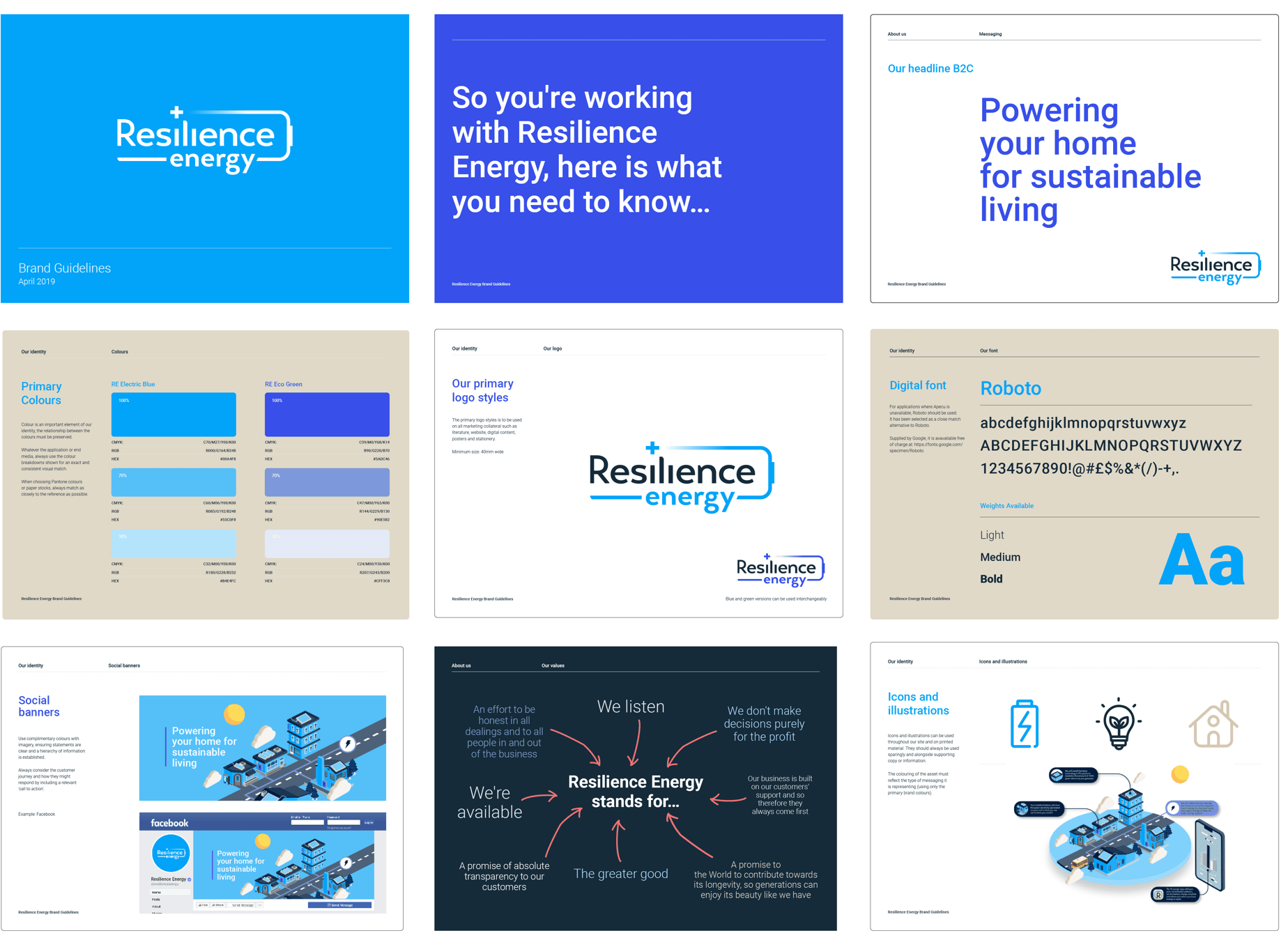
A portion of a brand guidelines document produced for Resilience Energy, a renewable energy company. Before designing a website and web app, we worked with them to establish their brand and then how it can be applied consistantly across wider marketing collateral
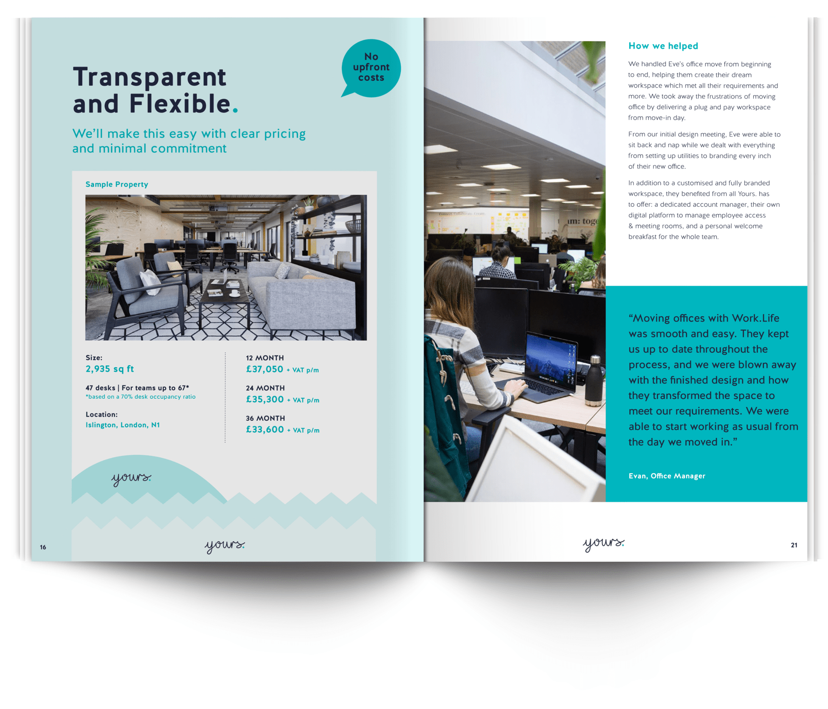
Brochure design, for the Work.Life sister brand, ‘Yours.’. Designed as part of a wider print campaign, including direct mail, building access cards and containers and stationery
Design for print
With some of our older designers starting their careers on paper, they have a passion for print and are well placed to help you realise your branding and marketing across brochures, direct mail, stationery and banners, as well as advertising. Helping you find pace and flow across 20 brochure pages, or have stand-out in a magazine, the same level of detail that goes into our digital design is carried through across printed media, providing your brand with that vital cohesion.
Our approach to UX
If it’s not easy for the user, bin it! Steve Jobs once said, “design is not just what it looks like and feels like. Design is how it works.” Effective UX is a critical part of our digital design process - it ensures that the products we make are both functional and effective, beyond just looking great. UX that is intuitive makes it easy for users to navigate and fulfill their needs from the product.
Our process
Our digital design process is tried and tested but we can tailor it to suit the stage, budget and maturity of all our clients. Our overarching principle is to always apply the latest techniques and back these up with careful research and strategic planning.
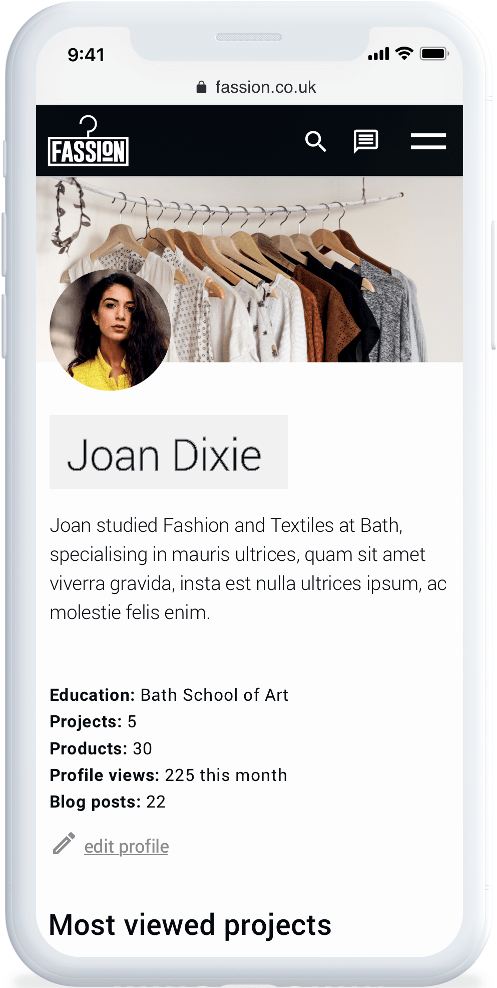
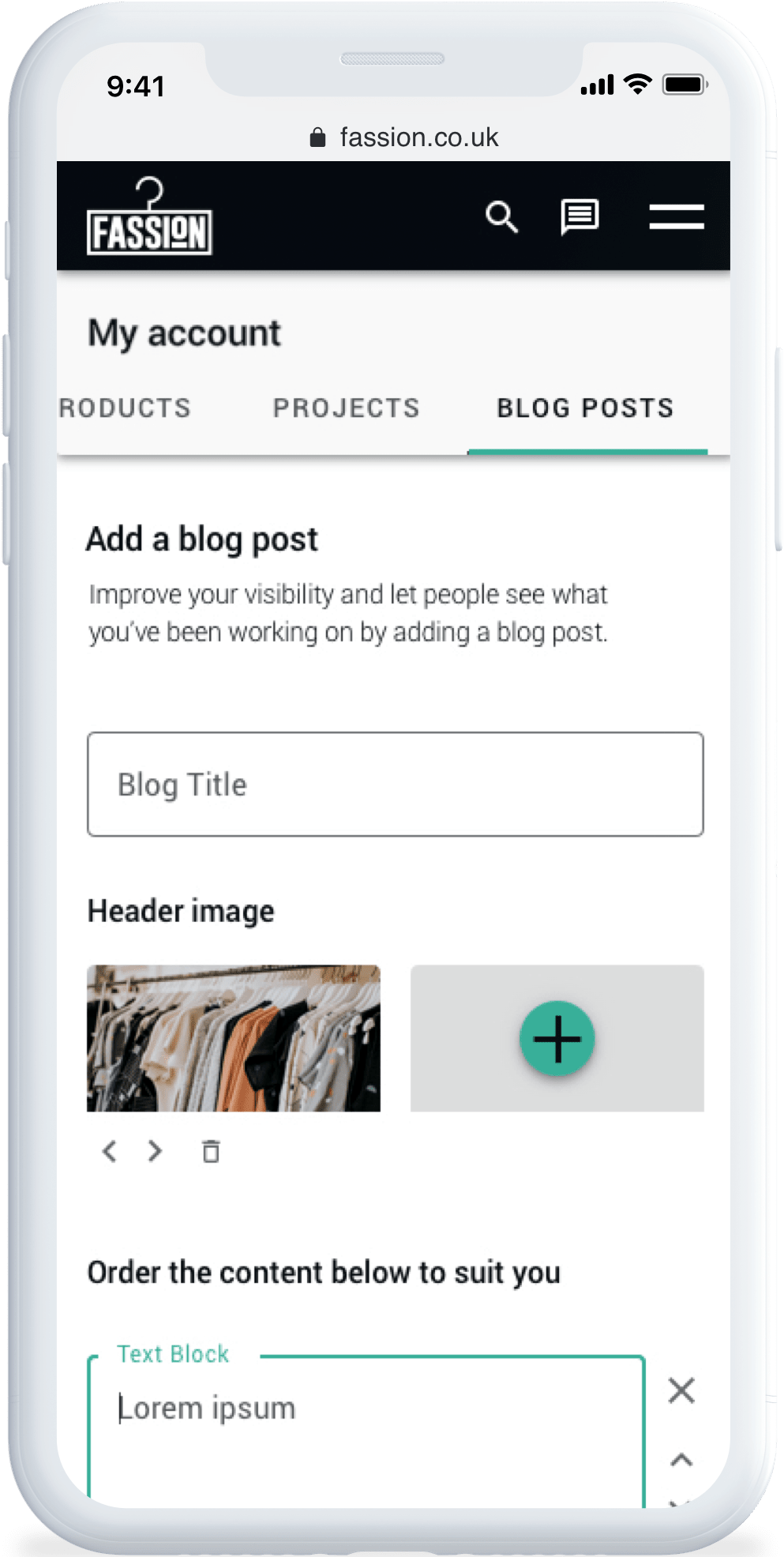
The high fidelity wireframes designed for the brand ‘Fassion’. They commissioned Deazy to design and build their MVP. The design process included UX and UI layouts.
Competitor research
Great value can be found in assessing the successes and failures of rival products. Not only does it help in avoiding similar pitfalls, it can also validate ideas, and ensure that your outcome is more unique, defined and less susceptible to threat.
Card sorting
A highly effective UX technique to help with define information architecture, wireframing and site maps. A selection of users or stakeholders are asked to order information into logical groups and hierarchies, using labelled cards or an equivalent digital tool.
Wireframing
We commonly categorise wireframing into two types – low and high fidelity. Often used as the starting point to the design process, low fidelity wireframes are two-dimensional sketches of the intended web pages, that specifically focus on space allocation and ordering of content, and the intended site functionality. On larger projects, high fidelity wireframes can be a useful addition, providing a halfway step to full designs, with no colour or graphics, they save time on unnecessary decoration, but help to provide an idea of scale and can be turned into prototypes for preliminary user testing.
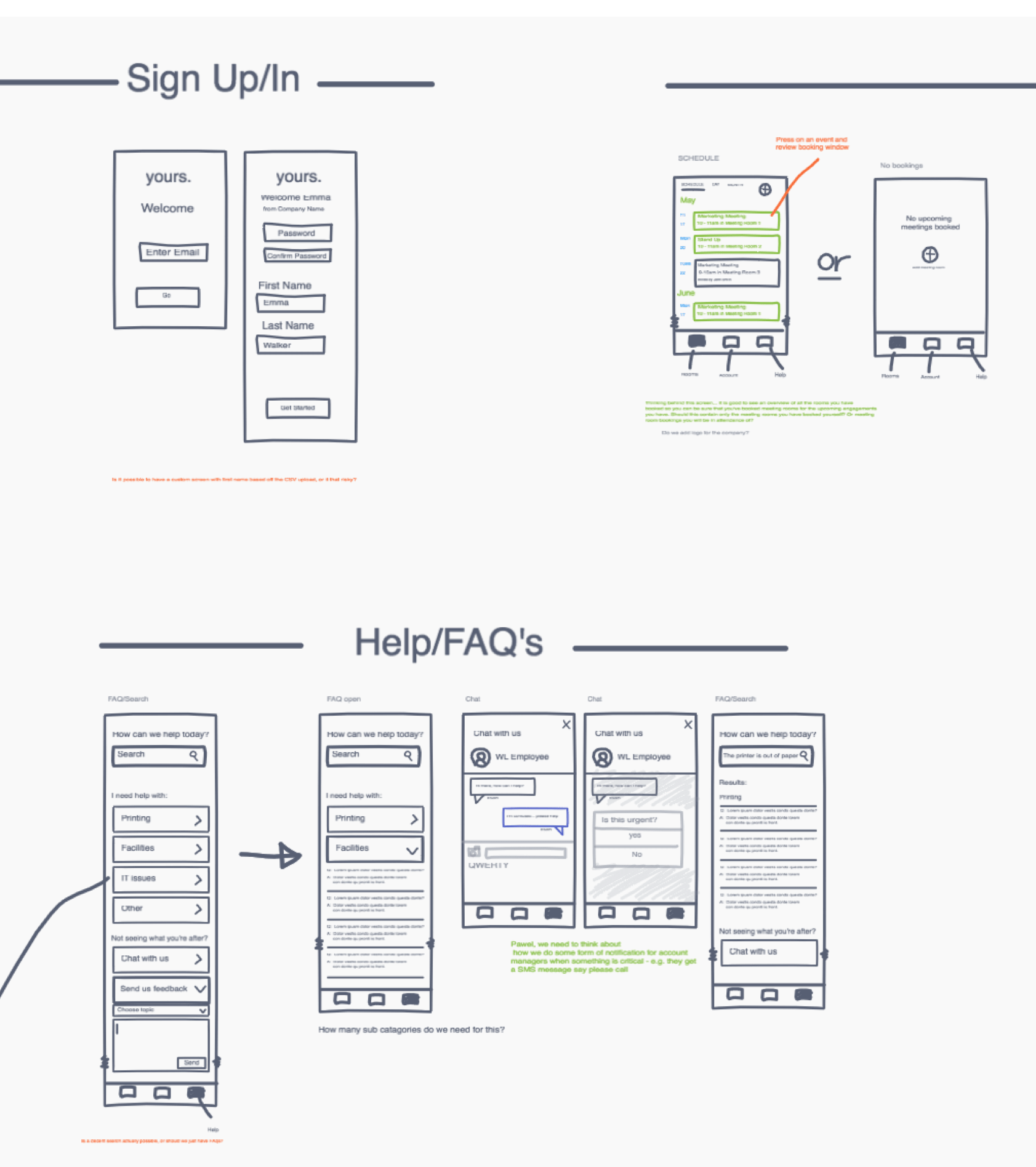
Low fidelity wireframes showing the user app produced for the brand yours. by Work.Life. They were laid out using an online collaborative tool, allowing the project to evolve in real time with client feedback.
Clickable prototypes
Clickable Prototypes are an interactive set of designed screens which allow the demonstration of a user journey and the option to engage with a product idea or feature. They offer a quick way to get feedback and validation on a product idea or specific feature without developing anything or writing a single line of code, saving unnecessary spend. They are often used for pitching to investors - to quickly bring to life and communicate a concept- or for validating an entire product or feature idea with potential users before moving to development.
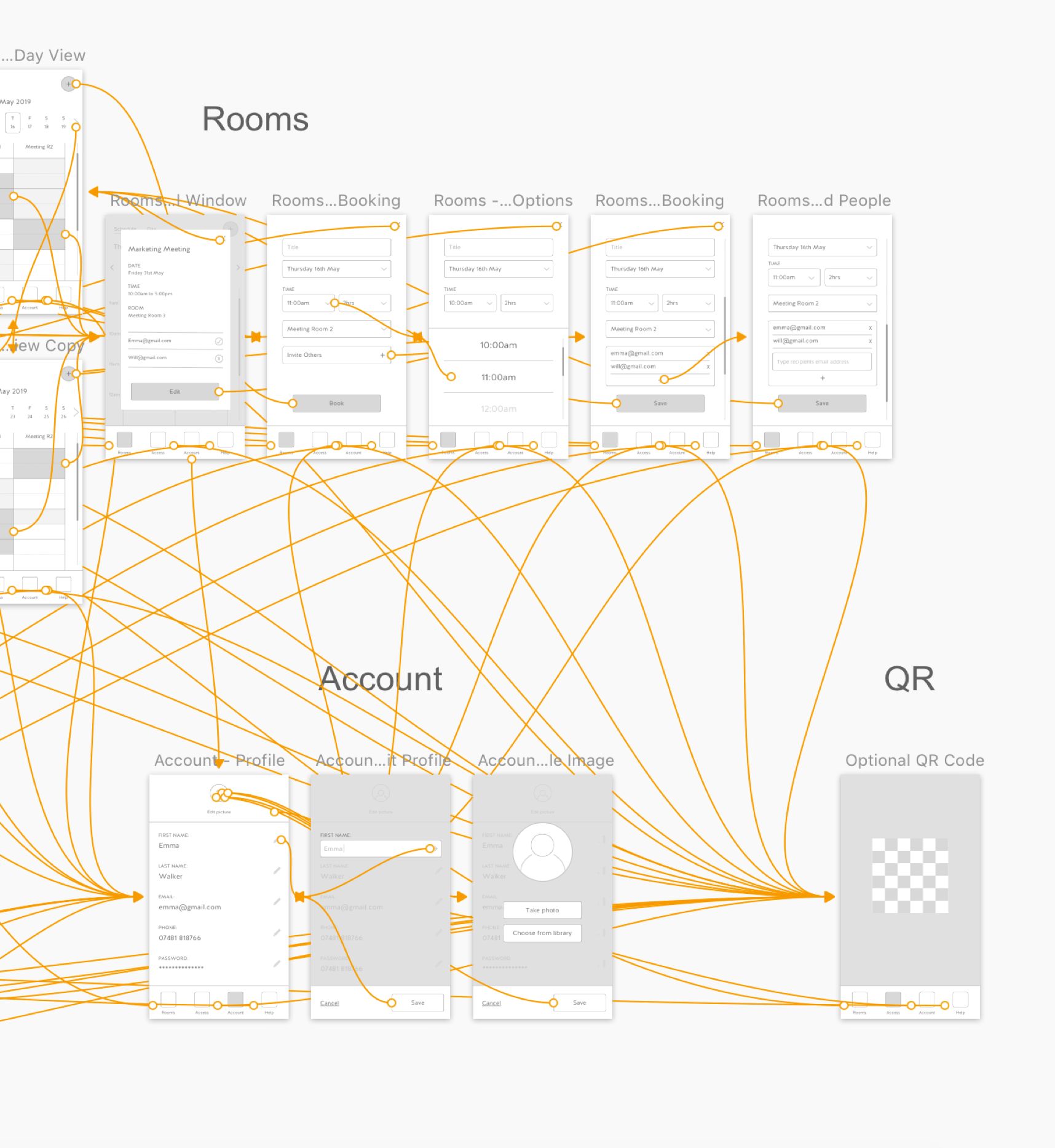
High fidelity wireframes, with screens linking together to produce an active clickable prototype. Links can be sent for user testing and feedback. Prototypes can be produced at this early stage, or from UI screens to allow for fine tuning or for promotional purposes.
A/B Testing
Not sure which is the right messaging for your product or which UX option is the most intuitive? A/B testing allows you to design two options (A and B) and test them against each other with user feedback or with real user interaction (once developed).
Usability Testing
Providing direct and indisputable input into how effective an application is at predictably engaging it’s audience, this can be a vital part of the UX process. Especially effective for a more mature product, the results have proven invaluable at improving performance.
UI that's powerful & engaging
User Interface (UI) brings the style, polish and identity to any tech product. It plays an important part in attracting the right audience, keeping users coming back and sharing your application with others.
With every project, we work with our clients to review brand communications that already exist, assessing what’s successful and why. For clients without the brand history, we create a unique style for them, through UI design, or looking at their brand as a whole. Combining that analysis and market research, we produce visually impactful, results-driven and effective interface design that is tailored and on-point for the client.
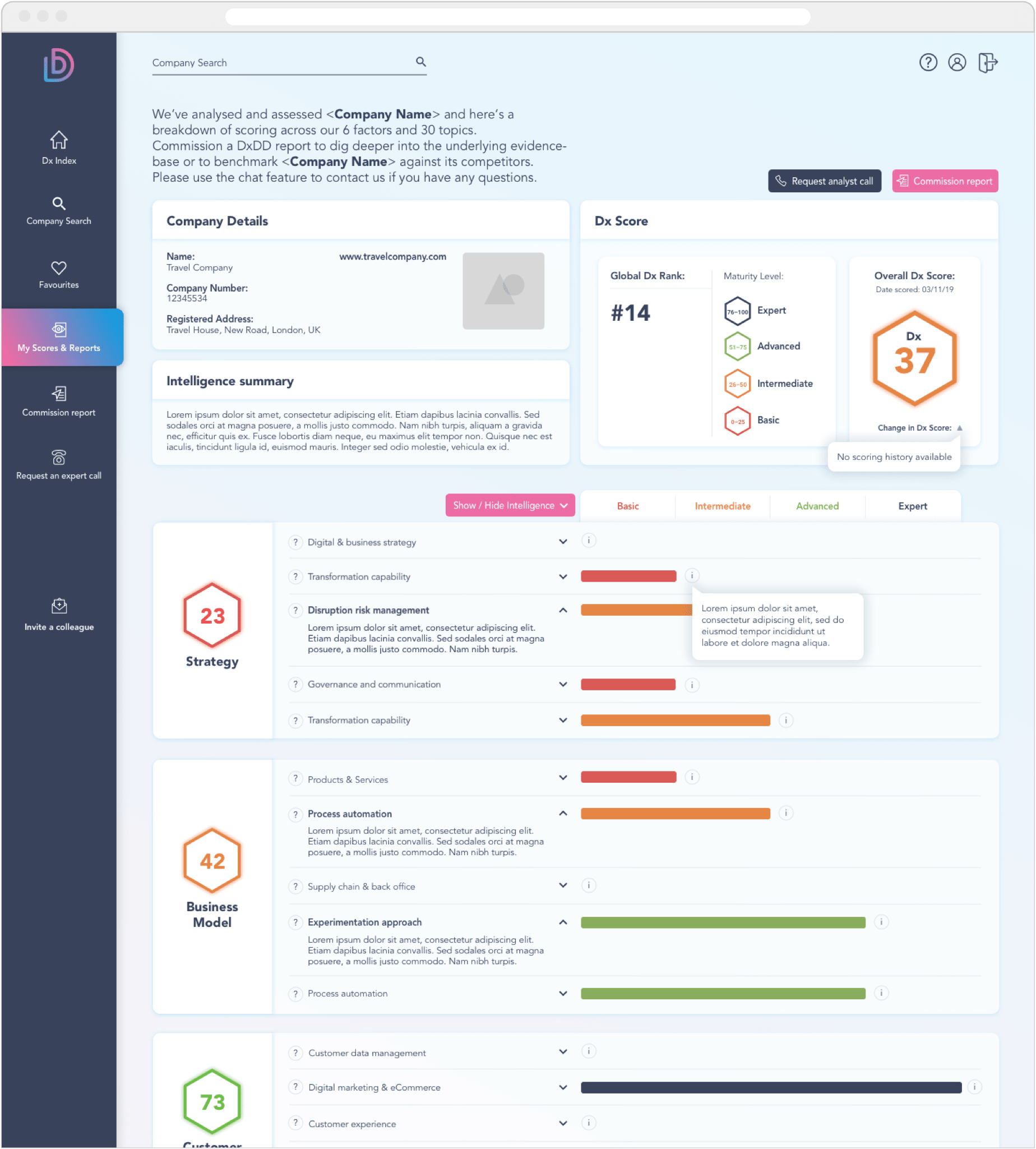
UI design produced for Agency Delta’s market index product ‘Deltabase’. We worked with them to produce everything from their initial branding, through UX and finally UI design. We continue to work them as the product develops from MVP into a more sophisticated tool.
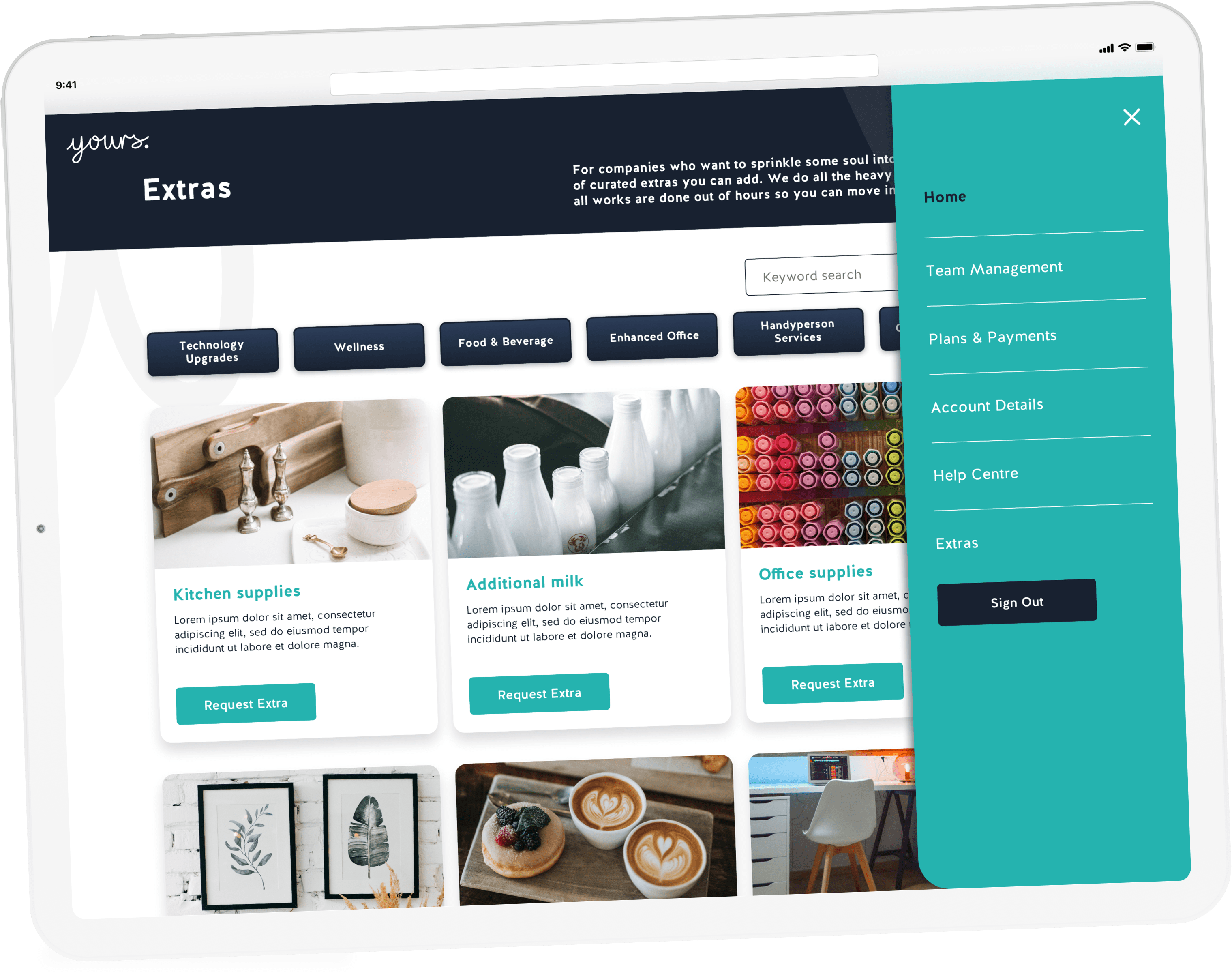

An app for Work.Life’s ‘Yours.’ brand. A bespoke workspace solution for buisness. This app allows ‘team leaders’ to manage their teams and recieve support from the ‘Yours.’ space management staff.